🎁 Exclusive Discount Just for You!
Today only: Get 30% OFF this course. Use code MYDEAL30 at checkout. Don’t miss out!
Mynda Treacy – Excel Dashboard Course

Do your Excel reports take a long time to update each month/week?
Do you spend hours collating data, updating formulas and charts and then feel like no one reads them anyway?
It doesn’t have to be that way.
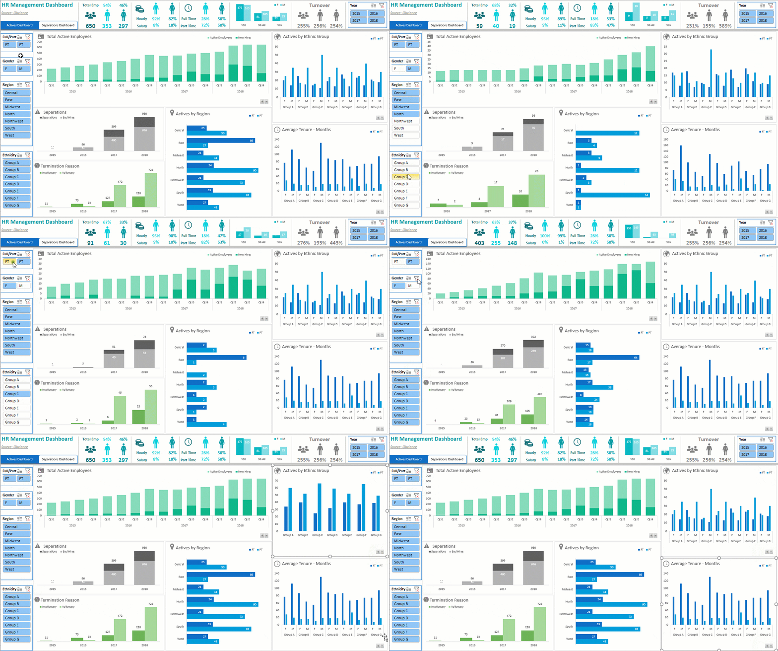
In my Excel Dashboard course I teach you how to create amazing interactive Excel dashboards, like the ones below, that update with the click of the Refresh button, or with a simple copy and paste of your new data into your spreadsheet. They’ll wow your boss and take your career to the next level.
So, what is an Excel Dashboard?
An Excel Dashboard provides insight, analysis and alerts. They’re fully interactive and dynamic and can help with project management, customer service, retail management, financial forecasting and much more.
Key features:
- Usually fits on one page
- Displays key trends, comparisons and data graphically or in small tables
- Provides the reader with conclusions to their objective
- Is often interactive allowing the user to filter data and switch views themselves
- Employs best practices that enable the report to be updated quickly and easily (often at the click of just one button)
What the Excel Dashboard Course Will Do For You
This comprehensive Excel Dashboard Course will teach you the simple techniques you can apply in Excel to make killer dashboards that will set your skill level apart from the crowd.
I teach you how to build Excel Dashboard reports from the ground up.
By applying the simple rules I share with you, you will have the skills to be able to create reports that save loads of time (allowing you to go home early :)) and you’ll quickly become known as a Dashboard Superhero with reports that are:
- Quick and easy to update, in fact they can update themselves (imagine being able to confidently say that in an interview) at the click of a button if you set them up right (I show you how).
- Fully interactive so the reader can change the view themselves; they can filter by product, time period or any parameter you choose, they can show and hide data using check boxes, drop down lists, and option buttons to name a few.
- Easy to read and interpret; plus I share with you a heat map of your page that shows you where your most important data should go and where will get the least attention.
- Exactly what the reader wants; I teach you the 5 key questions to ask and to who in the planning stage of your report so you get it right first time.
- Choose the right charts for your data; I teach you over 20 charts and show you which type of chart will best display your data.
Just take a look at the two charts below. Both plot the same data but one is much easier to make comparisons in the data than the other. You be the judge.
- Professional presentation. I teach you simple visualisation techniques so your reports will look like you’ve had a graphic designer involved even if you are completely lacking in artistic talent (like me).
What You Get in the Course
- 5.5 hours of video tutorials designed to get you building your own dashboards as quickly as possible, because I know you don’t really want to watch me building them, you want to build them yourself.
- The pace is pretty fast because I hate courses that waffle on. I like to get straight to the point so you’re up to speed fast, and I’ve designed it so that if you need to re-watch anything you can rewind and replay the videos as many times as you like, or just refer to the completed versions of the Excel workbooks.
- You can download the actual Excel files used in the filming.These files contain notes and links to further tutorials so you can fill in any gaps in your knowledge. Use the ‘before’ versions of the files to practice what you learn in the video, after all, we learn best by doing. And use the ‘after’ versions of the files to refresh your memory. Chart Chooser PDF helps you find the charts that suit your data structure. Plotting your data in the right chart type can make the difference between getting your message across and hiding it altogether.
- 3 x sample Excel dashboard reports Use them to steal ideas from and reverse engineer.
- Homework Challenge. Practice what you learn so that you don’t forget it. Plus you’ll be creating a dashboard of your own that you could use for job interviews to showcase your skills. If you like you can even send it to me and I’ll review it and give you feedback.
- 12 months of support from me. We have a dedicated support forum for Dashboard course members where you can post a question and I’ll post you an answer. These Q&A’s will be available for everyone in the class to learn from too (you can even post the answer to your classmate’s questions if you know it), making it a truly interactive class. Or, if you prefer you can email me your questions direct.
Support of my members is very important to me and is valuable to my members, as you can see from this email from Arash:
“I feel like I have a 24hr support. The way you reply and support, in terms of time and effectiveness is not comparable to other websites and people who provide learning modules. You are Superb!!!”
- The training is delivered online and tutorials are available to watch 24/7 at your own pace. Pause, rewind, replay as many times as you like.
- 12 months access to the video tutorials and file downloads. There’s even a download option where you can download all videos in the course and keep them on your own PC forever.
- When you’ve finished I’ll send you a ‘Certificate of Completion’ saying you’ve completed the course which you can add to your résumé/CV arsenal.
Watch a Sample Tutorial
Click on the video below to start watching. Click on the white rectangle on the bottom right of the video control bar to watch the video in full screen.
Who Is It For?
The course is for you if you:
- Already prepare reports of any kind that require updating with new data on a regular basis (weekly, monthly….) and or,
- Want to learn how to build interactive dashboard reports and or,
- Want to change career or apply for a new job and or,
- Work with charts and or,
- Work with large volumes of data and or;
- Import data into Excel from another source e.g. another database, Access, Web, Text files etc. and or,
- Often don’t know the best chart to use to display your data.
Prerequisites:
- Have access to Excel 2007 or later. Mac Users: This course is filmed in Excel for PC, however if you’re fairly savvy you will be able to map the menus you see in the videos to your Mac equivalents. Many Mac users have successfully taken this course. The Dashboard concepts and most of the formulas are applicable to any version of Excel.
- Be able to build and apply basic formulas in Excel.
- Pivot Table and Pivot Chart knowledge is helpful, but expertise is not necessary to take this course.
Note: This course is not for complete beginners but if you’ve put together any type of report in Excel before then you will definitely benefit from the time saving tips and data visualisation techniques I share with you.
Knowing How to Make Amazing Excel Dashboards Will Take Your Career to the Next Level
Excel Dashboards are the new buzzword employers are looking for.
If you have, or want a career that involves creating reports in Excel, then you need to know how to create impressive, interactive, and easy to read Dashboards
This course will get your skills up to date by teaching you how to create Dashboards that will wow your boss (or your prospective employer) even if you don’t have an artistic bone in your body.
Course Features
- Lectures 0
- Quizzes 0
- Duration 10 weeks
- Skill level All levels
- Language English
- Students 78
- Assessments Yes


